Everything I needed to make sense of pain.
was made by someone who lives with severe pain, for anyone who lives with pain: people whose pain followed an illness, an injury or an operation, veterans whose pain followed their service, and people whose pain nobody has yet explained.
On iPhone, Android and the web. In alpha, heading into beta testing, by invitation only.
does not diagnose or recommend treatment, and it does not forecast your pain. It is made by the Mathematical Institute for Research of Pain. Read the privacy notice.
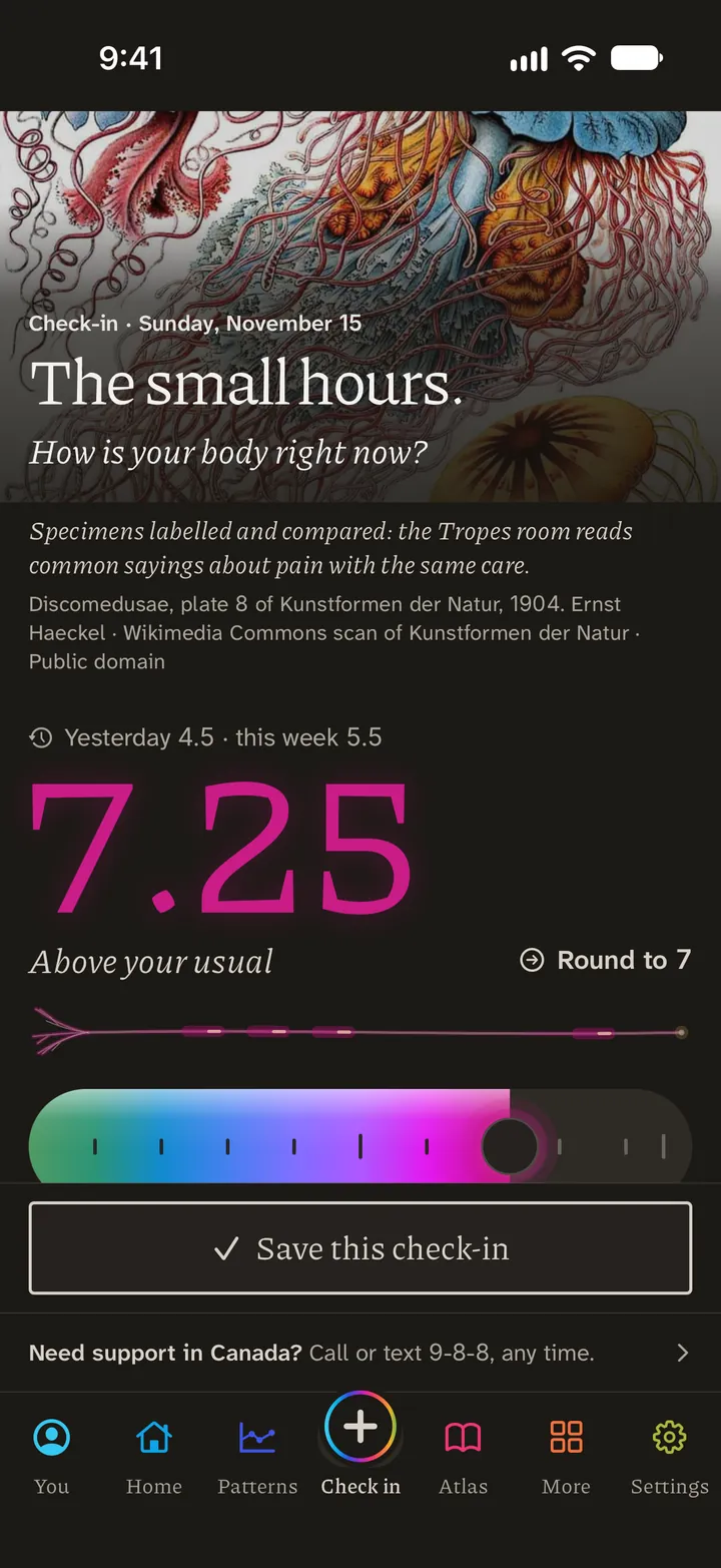
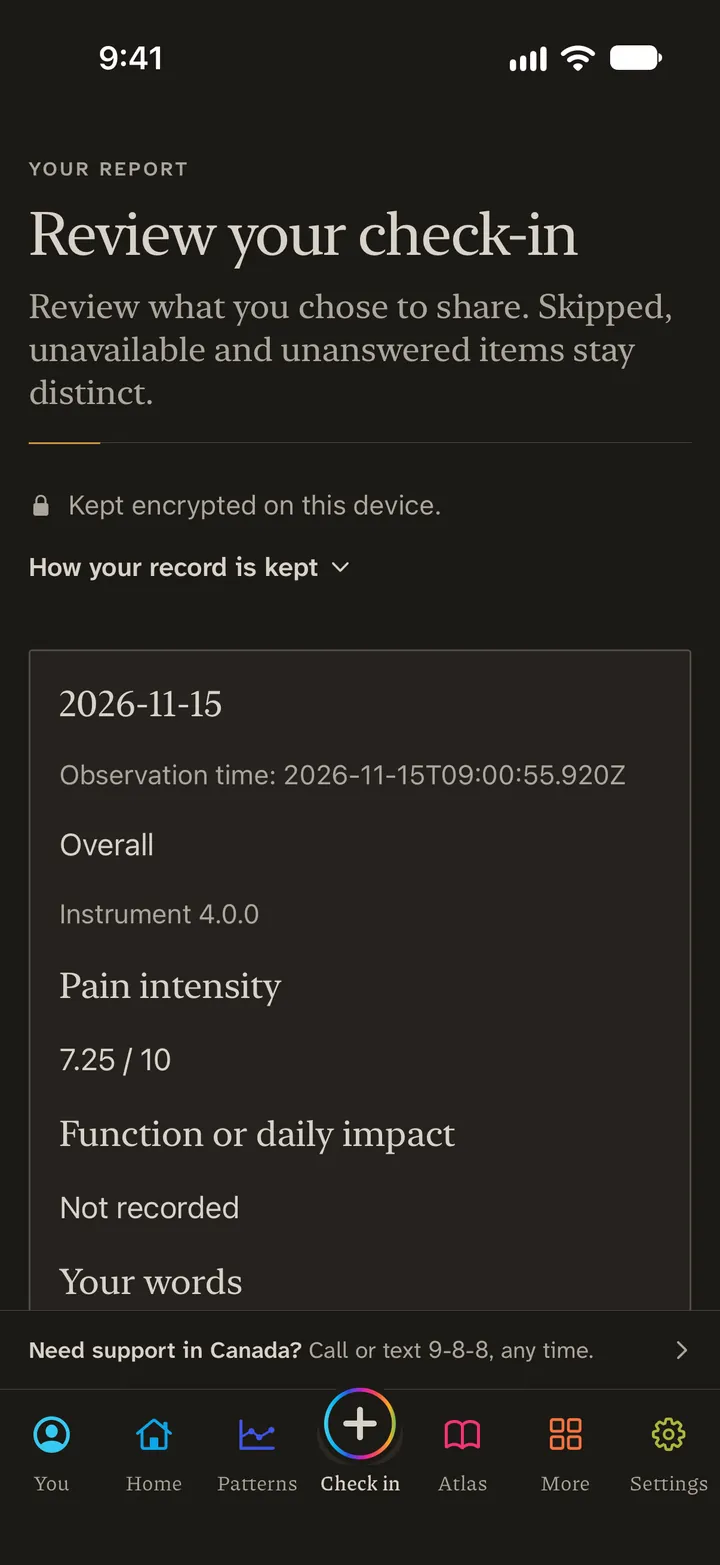
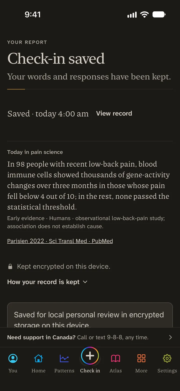
Inside The app’s own screens. Every record shown is an example, never a real person’s.
The check-in
One number is enough.
Rate your pain from 0 to 10, to two decimal places, with your own words beside it when you have them.
Read more about the check-in
What it is. A check-in: pain from 0 to 10, to two decimal places, with your own words beside it. Twelve plain pain words, one tap each. Any of 26 body regions. The Flare clock. One tap in the night when you wake.
What it does for you. On a bad night you can rate in the dark, by touch, on a black screen. In a flare you mark when it starts and when it eases, and the clock keeps how long yours last. A day you miss stays a gap. It is never filled in for you.
Why it is there. Pain moves, and one number at an appointment cannot show that. A record that costs almost nothing to keep can.
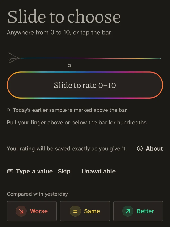 123
Slide, or tap anywhere on the bar.
Pull up or down for hundredths.
Or type the number, skip it, or mark it unavailable.
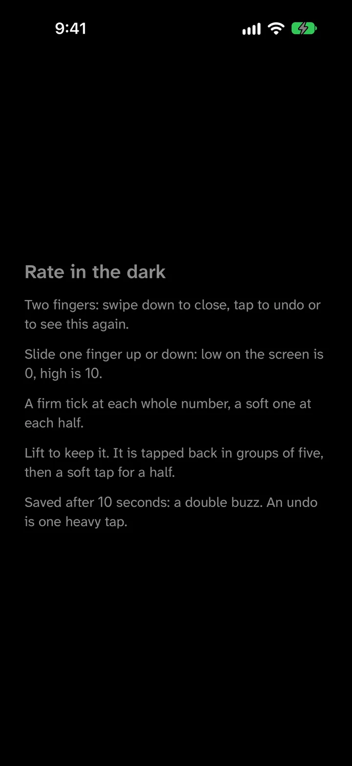
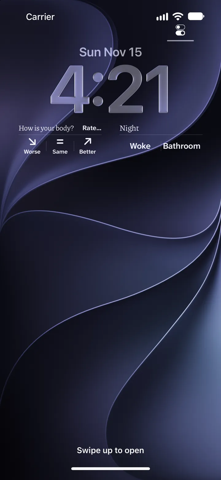
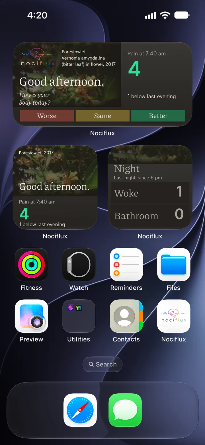
The Flare clock and Speak for me
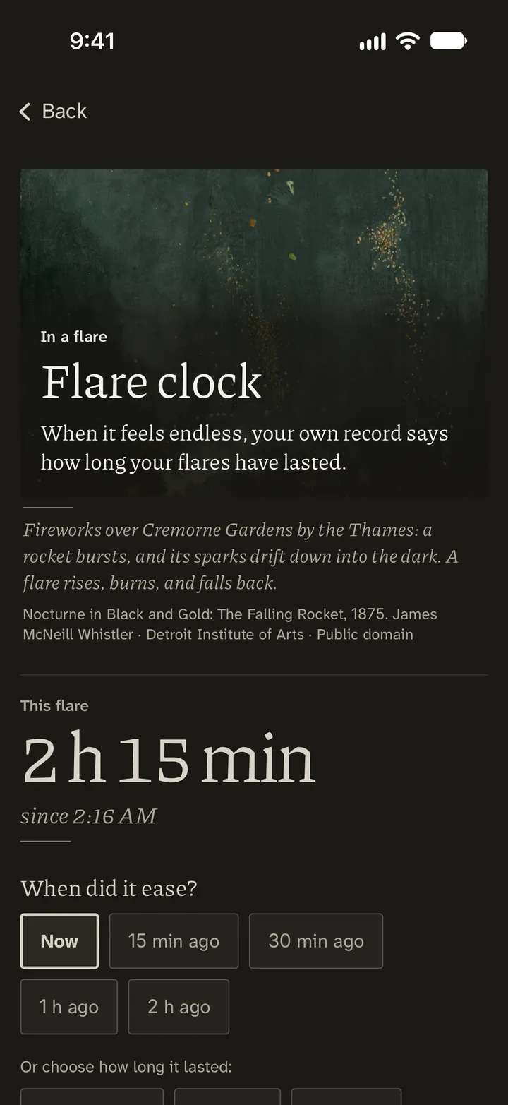
When it feels endless.
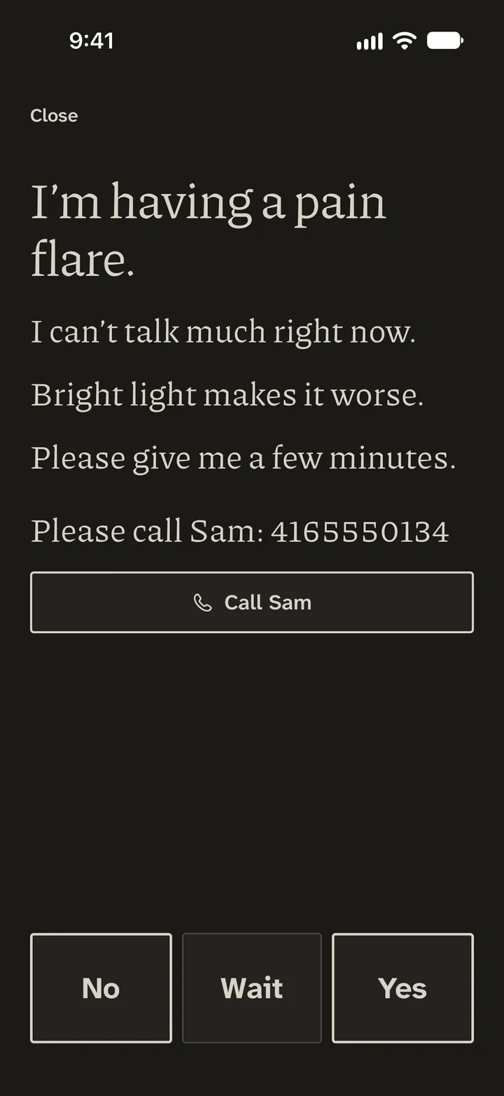
The clock keeps how long your flares last, and a card you wrote on a calmer day speaks when talking is too much.
Read more about Speak for me, and Talk
What it is. Talk lets you ask or tell, by voice or by typing, and can draft a check-in or a journal line for you to keep or discard. On iPhone, in this version, Talk cannot answer until you add your own OpenAI access key, and it sends nothing until you allow it. Speak for me needs nothing but the phone.
What it does for you. You write the card on a calmer day: “I’m having a pain flare.” “I can’t talk much right now.” “Please give me a few minutes.” In a flare you hold it up. It carries three large answers, No, Wait and Yes, and it can carry a button to call the person you chose.
Why it is there. There are hours when typing is too much and hours when talking is. Neither should leave you with no way to be understood.
Pain has an element of blank; It cannot recollect When it began, or if there were A day when it was not.
 12
This flare, timed from the start you chose.
It eased earlier? Choose when.
The N-of-1 Lab
Let the coin choose.
A fair test of one everyday change, on you. The Randomised pairs design: six pairs of weeks, a coin for the order, a sealed plan.
Read more about the N-of-1 Lab
What it is. A way to test one change on one person. It is for everyday changes, such as a bedtime, a walk, caffeine or a magnesium supplement. It never tests a change to a pain medicine. Studies run in the phone app. On nociflux.com you can plan one, and it does not start there.
What it does for you. Say you want to know whether an hour without screens before bed changes your pain. That is one of the Lab’s own starters. In the Randomised pairs design the Lab sets out six pairs of weeks. For each pair a coin decides which week gets the change, and the plan is sealed before the first rating counts. You rate your pain as you always do. At the end the Lab shows how far the change weeks differed from the usual ones and says either “A clear difference” or “Not clear”. Not clear is an answer too, and it is different from no difference.
What it cannot do. You know which week is which, so this is not a blinded trial, and expectation can still move a rating. The Lab reports what your own days showed. It does not forecast.
Why it is there. A trial tells you what happened to a group on average. Pain also moves from week to week whatever you do, so a good fortnight after starting something proves little. I wanted the coin, and not my hope or a bad week, to choose which days count.
I think your solution is just; but why think,—why not try the experiment?
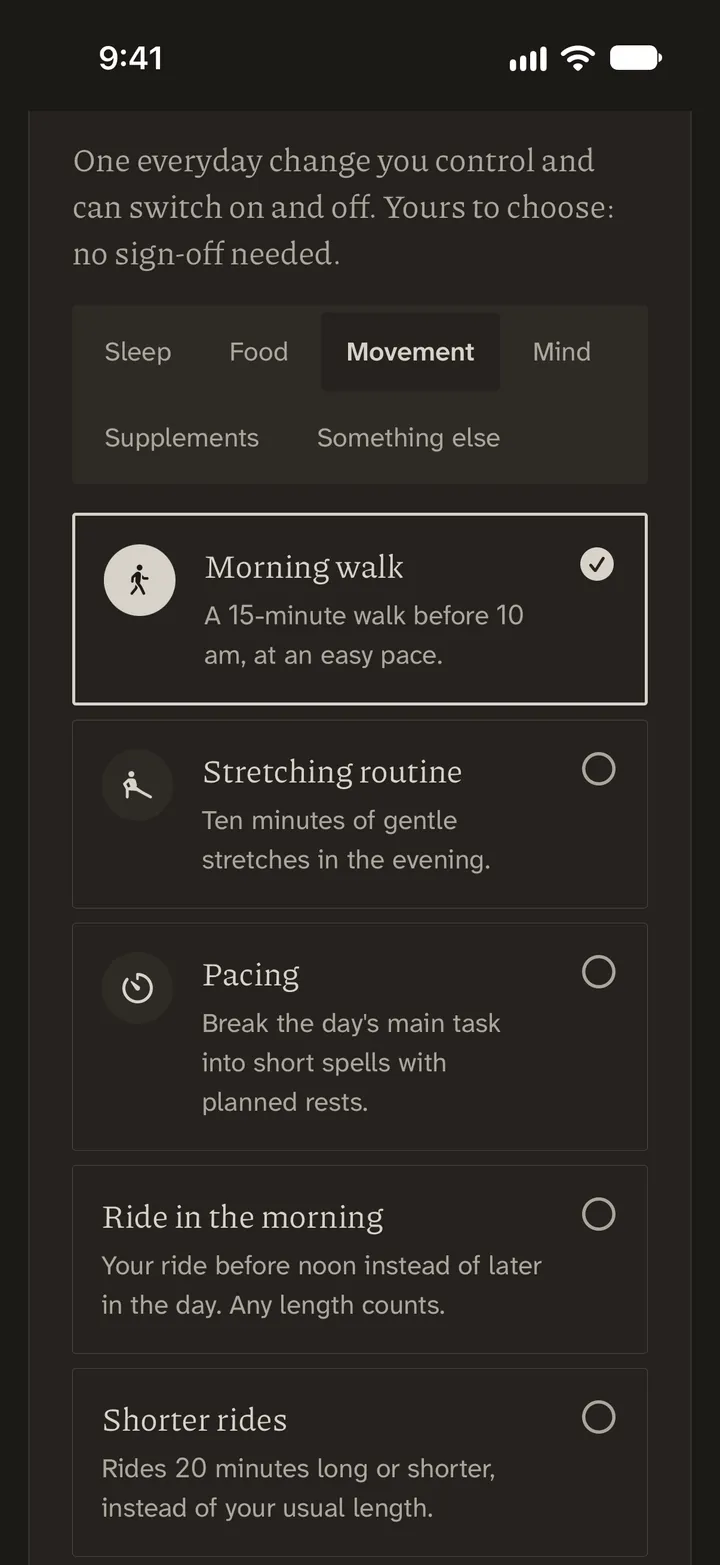
Choose. One everyday change you can switch on and off. No sign-off needed. 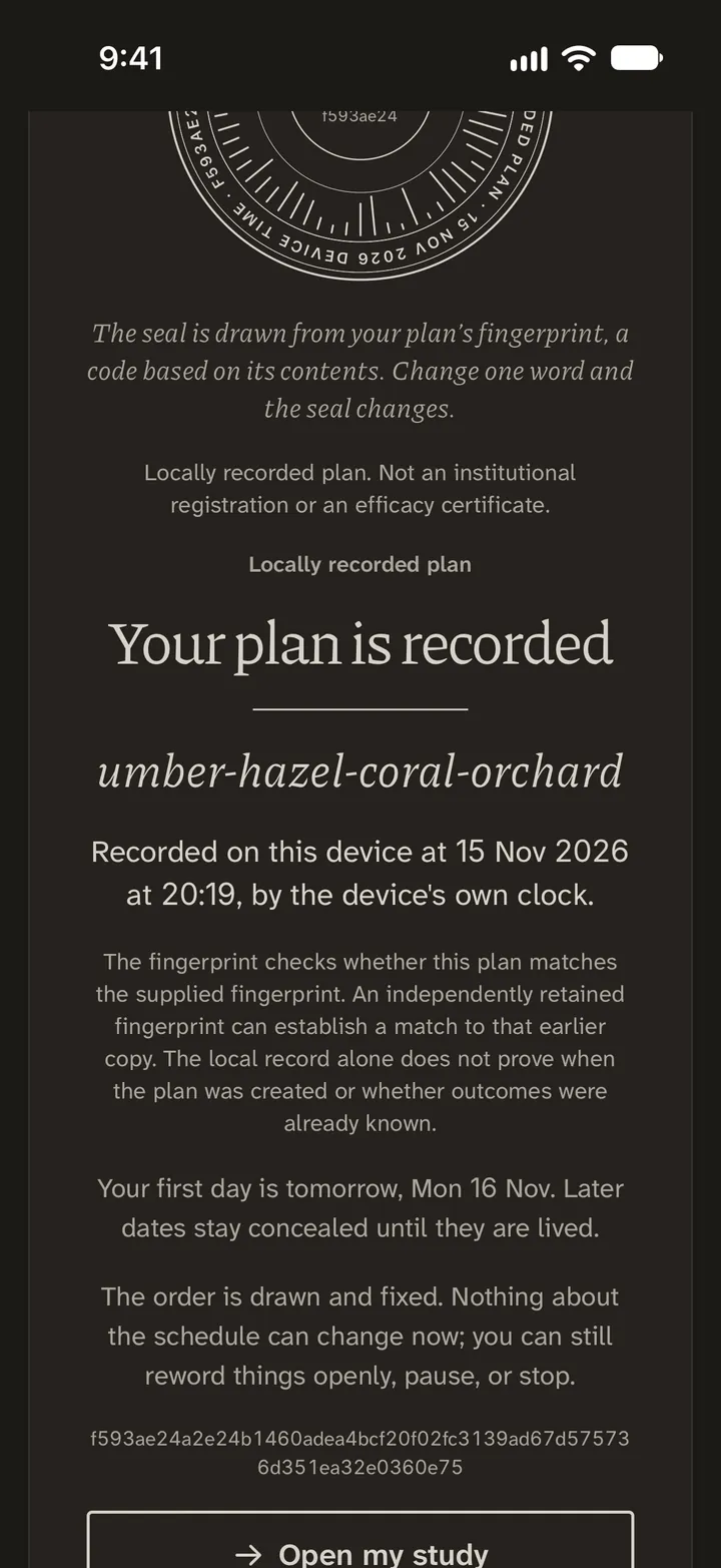
Seal. The order is drawn by coin and fixed. 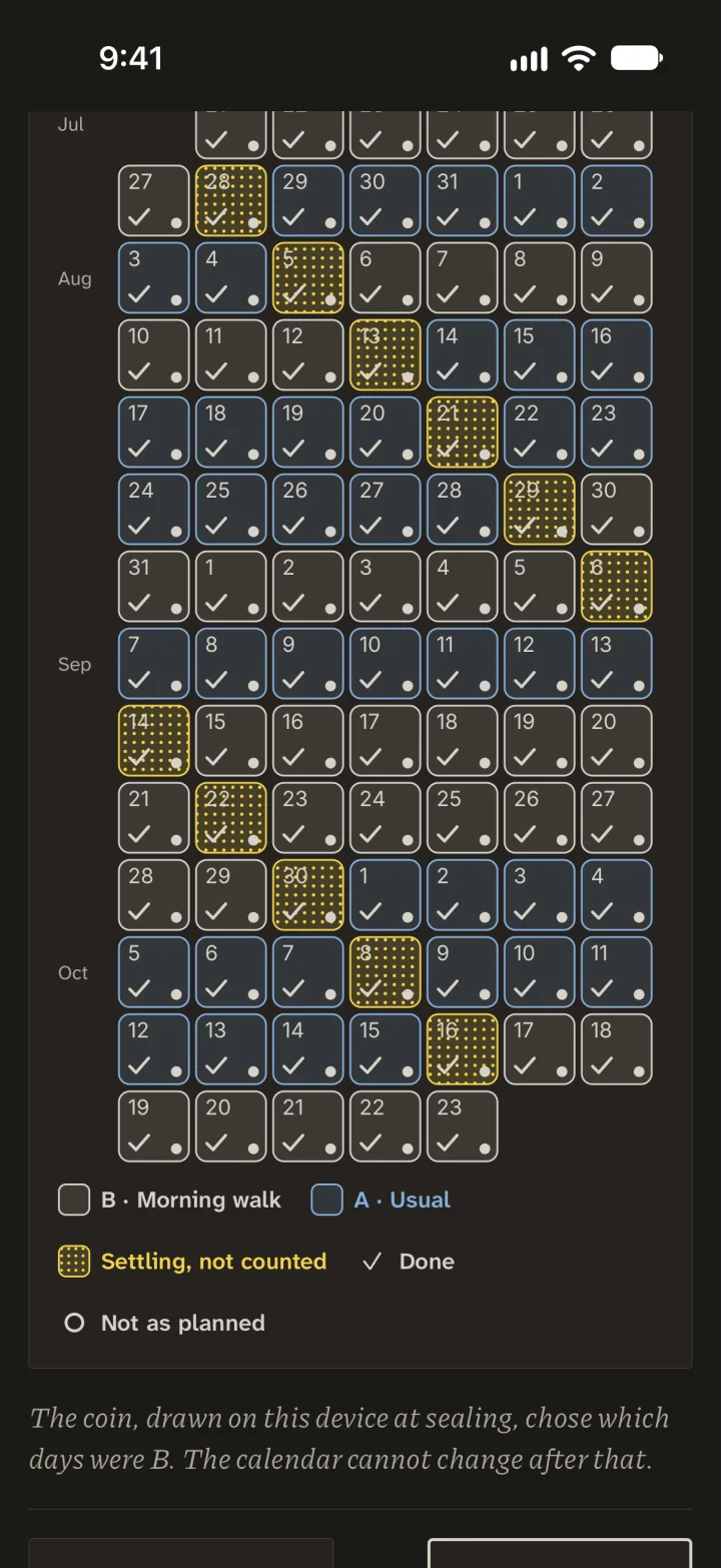
Live the weeks. Rate your pain as always; the day after each switch is not counted. This calendar is from an earlier study. 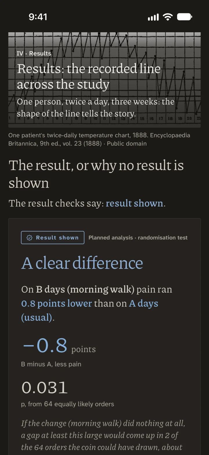
Read the answer. Here, 0.8 points lower on walk days. Chance alone does that in 2 of 64 orders (about 3 in 100).
Sometimes the answer is “not clear”. It is not a blinded trial; it runs in the phone app and never tests a change to a pain medicine.
See a whole study, drawn day by day
A study of many people tells you what happened on average. The Lab is for the question an average cannot answer: does this change anything for me? In a study like the one below, the Lab sets the order of the weeks by coin before you begin and seals the plan, so that neither hope nor a bad week can choose which days count.
Twelve invented one-person studies of 95 days: which of nine changes moved the pain rating, and how far
Pain 0 to 10, rated each day. Each study: six pairs of weeks; a coin chose which week of each pair had the change. 84 counted days, 11 settling days.
Cefaly Prevent, 20 minutes each evening. Head pain, 13 April to 16 July 2026.
pain, 0 to 10 scale
pair 2, 28 April to 13 May
FIf Cefaly did nothing: the 64 ways the six coins could have fallen
the average of the six gaps, change week minus usual week, in points
A one counted day; its height is that day’s rating divided by seven, so seven of them stand as tall as the week’s average.
Ba week’s stack; the number under it is the week’s average.
Cthe gap in one pair: the change week’s average minus the usual week’s, green where lower, red where higher.
Dthe small number before a week: its settling day, rated, not counted.
EEach rating is coloured against the day before (settling days count), each average against the week before: red higher, yellow the same, green lower.
Fthe 64 ways the six coins could have fallen. If Cefaly made no difference to any day’s rating, only 2 of the 64 would give an average gap at least this far from zero, in either direction.
G(for the row below) one study’s answer, the average of its six gaps. Filled: clear, at most 3 of the 64 ways as far out. Hollow: not clear, which is different from no difference. A mix tests two changes together; it cannot say whether one or both did it, and its bar is not the sum of the two alone.
HThe person’s own tick says whether the change happened; the Lab reads no Cefaly, Muse or Calm log.
* the change did not happen that day; the rating stays in, as assigned.
average gap, in points
No added sugar + Muse meditation, together 2 of 64 1.28 lower
Cefaly + Magtein, together 2 of 64 1.06 lower
Lights-out + soundscape, together 2 of 64 0.93 lower
Cefaly 2 of 64 0.78 lower shown above
Lights-out by 22:30 2 of 64 0.69 lower
Muse meditation 2 of 64 0.64 lower
Calm scene 2 of 64 0.50 lower
Muse soundscape 12 of 64 0.31 lower, not clear
Magtein 26 of 64 0.18 lower, not clear
No added sugar 36 of 64 0.10 lower, not clear
TUDCA 26 of 64 0.27 higher, not clear
Walk 2 of 64 0.60 higher
Drawn on the page from the Lab’s own figures and numbers.
Read how the Lab works
Every study in the figure is invented, made to show what the N-of-1 Lab, a lab for studies of one person, does with that person’s own ratings. Each follows a single person for 95 days, with pain rated from 0 to 10 each day, and asks whether one change moved it. The large study is Cefaly Prevent, used for 20 minutes each evening against head pain, from 13 April to 16 July 2026. Its answer, 0.78 lower, is printed on the mark itself. One of its six pairs of weeks is opened so that every rating can be read, and 64 short rows show each way the study’s six coins could have fallen. The figure ends with all twelve studies ranked by their answers, from 1.28 lower to 0.60 higher.
The studies in the figure work in pairs of weeks. For each of six pairs a coin chooses which week carries the change and which stays as usual, and the plan is sealed before the first rating counts. Eleven settling days, rated but not counted, stand before every week except the first, which leaves 84 counted days out of 95. In the figure each counted day is a brick, a week is a stack of seven, and the number under a stack is the week’s average. The gap in a pair is the change week’s average minus the usual week’s. In the Cefaly study all six gaps fall below zero, from −1.336 to −0.093 points, and their mean is the 0.78 lower on the mark. The coin rows measure how unusual that is. If Cefaly made no difference to any day’s rating, each gap was as likely to fall the other way, so the Lab tries all 64 ways of keeping or flipping their signs. The letter F on the figure gives the count.
This matters because pain moves from week to week anyway, and a good fortnight after starting something proves little on its own. Because each gap compares a change week with its own usual week, a movement that both weeks share does not become part of the gap. The colours show that ordinary drift. Each rating after the first is coloured against the day before, settling days included, and each average after the first against the week before, red for higher, yellow for the same and green for lower. A colour marks which way a number moved, and nothing more.
In the figure an answer comes in one of two kinds. A filled mark is clear, which means at most 3 of the 64 ways reach as far out as what happened. A hollow mark is not clear, which is different from no difference, and four of the twelve are hollow. A mix of two changes tests them together and cannot say whether one or both did it, and its bar is not the sum of the two alone. The Lab reports what your own days show and does not forecast how your pain will go, and what you do with an answer stays your decision.
The Lab is open for everyday changes such as a bedtime, a walk, caffeine or a magnesium supplement. It does not run changes to pain medicines. The app never suggests a medicine, a dose or a change to either, and it never works out when a next dose is allowed. If the sealed design or schedule is changed partway, the Lab gives no result. The person’s own tick says whether the change happened, and the Lab reads no Cefaly, Muse or Calm log.
Your own record
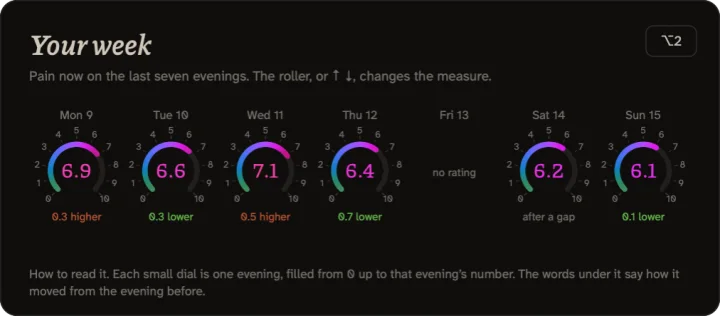
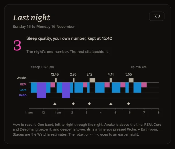
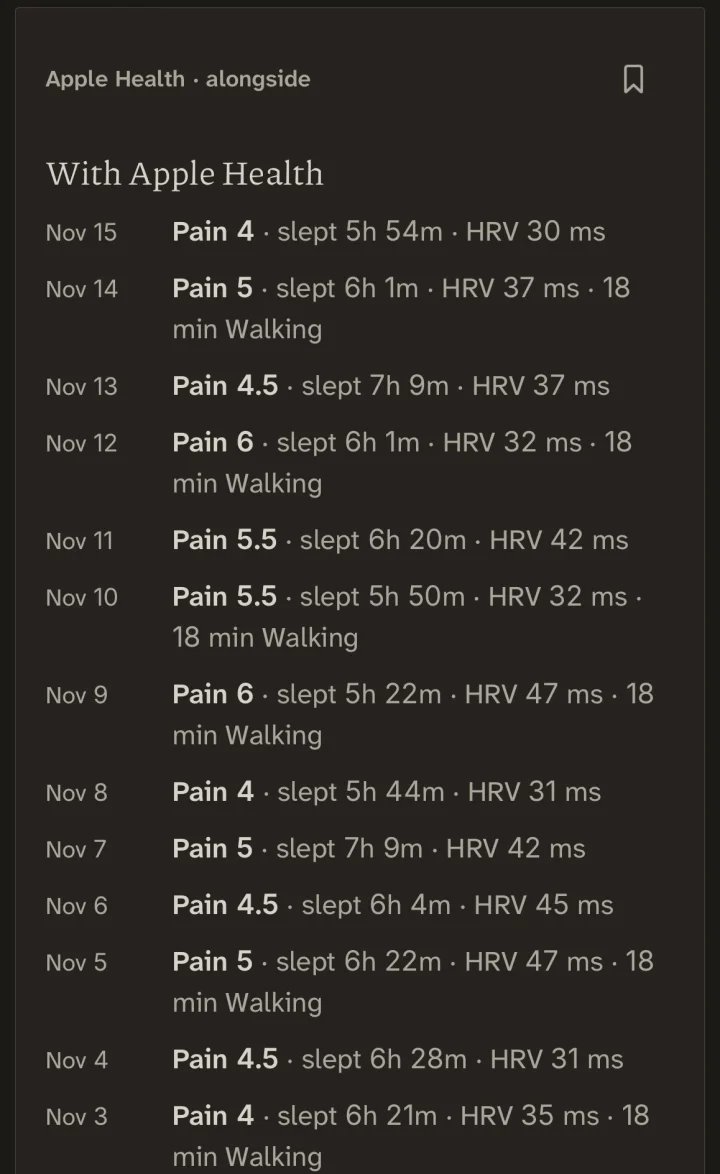
The app reads the days outside a study too. Follow one stretch of days through it. Patterns shows what the record holds over time and Trends follows your reports across the weeks, while Your week sets those days beside what your body and your devices recorded. Insights then describes the stretch or compares it with another, and one view sets the last two complete months against the two before. What it can say rests on your overall ratings, so it cannot tell why a change happened, and what it flags as an early signal is a pattern to check again. Where an entry is missing, the gap stays visible and is never filled, and no generated summary replaces your own words.
Trials, and how to read one
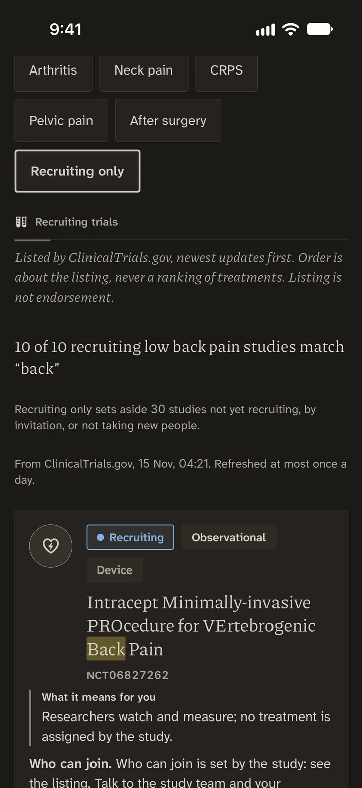
also lists recruiting clinical trials from ClinicalTrials.gov, with a plain reading of what a listing can and cannot tell you, alongside notable recent studies. A listing says that a study was planned and what it means to measure, and no more: not that a treatment works, that it is safe for you or that the study is a good one, nor whether you qualify or a place is still open. Studies you save are kept on the phone only, and on nociflux.com a shortlist and its notes stay in that browser. The visit packet turns a saved study into a plain summary to bring to a clinician, and it never says whether anyone can take part.
The Lab’s other rooms
Around the Lab are rooms for learning how such a test works before you run one. In the Pain Science Lab you change the inputs of five educational models and follow the signals that result. The Statistics Lab then shows, with invented data, how averages, missing reports and comparisons change what a pain record can tell you, and two puzzles make that concrete, one with weeks that share an average but not their days, the other with the moments that never reach a record. The Methods book is the reference for all of it, kept apart from Your Manual. When you run a study of your own, it has its own home, with its plan, schedule, diary, results, statistics and limits. The paired weeks in the figure are one of the Lab’s eight designs, and seven of the eight use a randomisation test.
The Atlas
What is known, and what is said.
439 readings on what is known about pain, each with its sources.
Read more about the Atlas
What it is. A library at three depths, built around eleven questions.
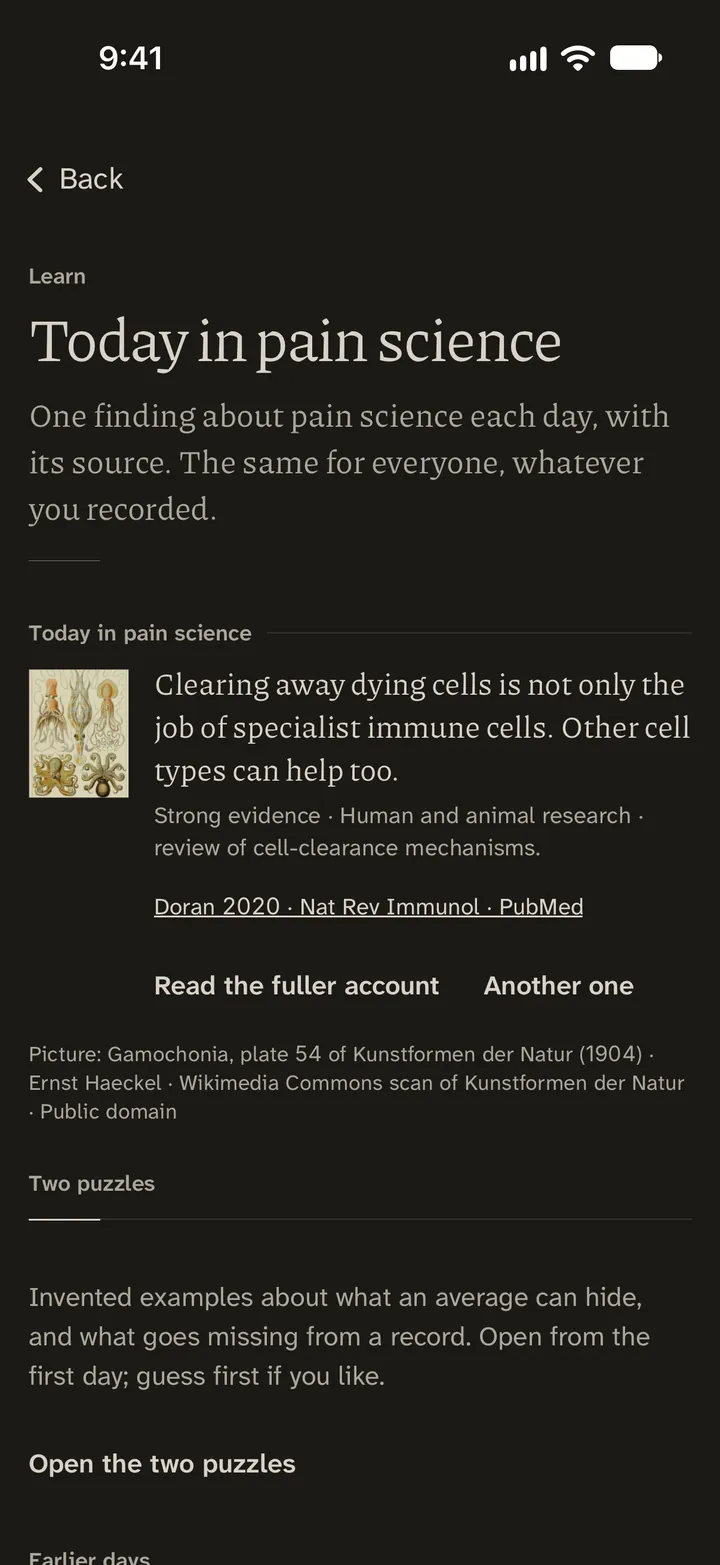
What it does for you. “Why some pain persists” takes nine mechanisms in turn, each with its evidence, and says plainly that persistence is not weakness or imagination. Today in pain science brings one sourced fact a day.
Why it is there. So that what is known, and how well it is known, is in one place you can read on a bad day.
Listen. Read to me speaks the Atlas reading you have open. For the days when a screen is too bright to look at.
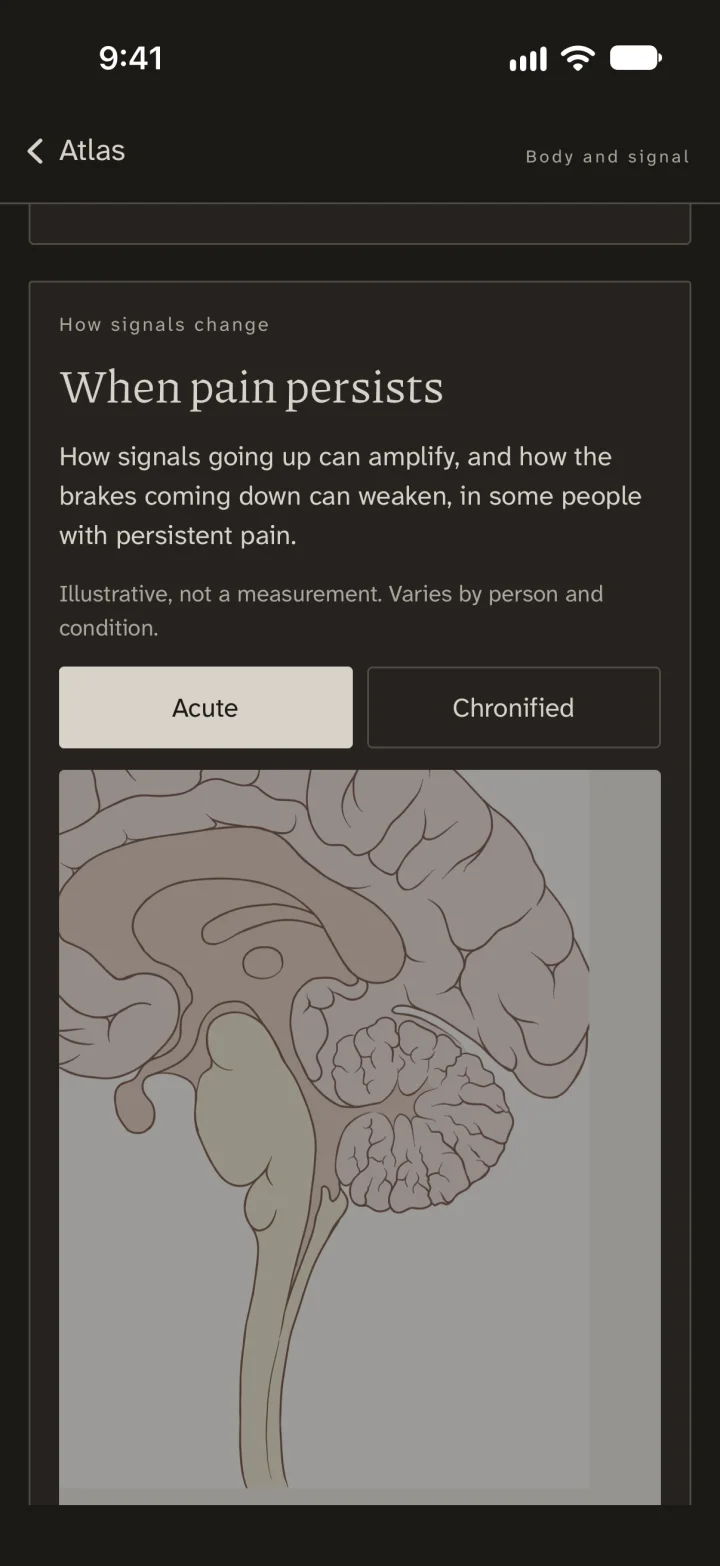 12
Marked as illustrative.
Compare Acute with Chronified.
Logic, Tropes and the Codex
What people say about pain, weighed in plain words, for the day a clinician, a relative or a colleague says it to you.
Logic of Pain · 56 arguments, their form machine-checked in 171 theorems
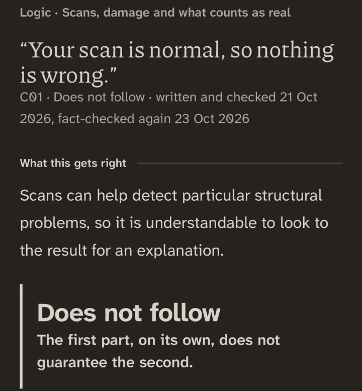
“Your scan is normal, so nothing is wrong.”
Tropes · 49 entries
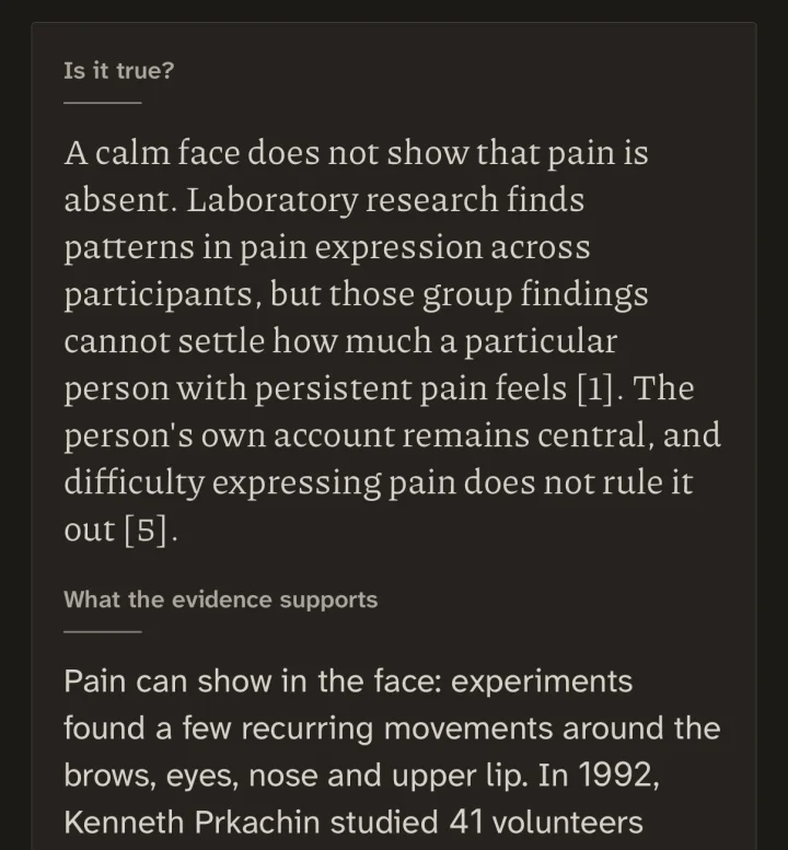
A face read as a measurement
Show the saying
“You look fine.”
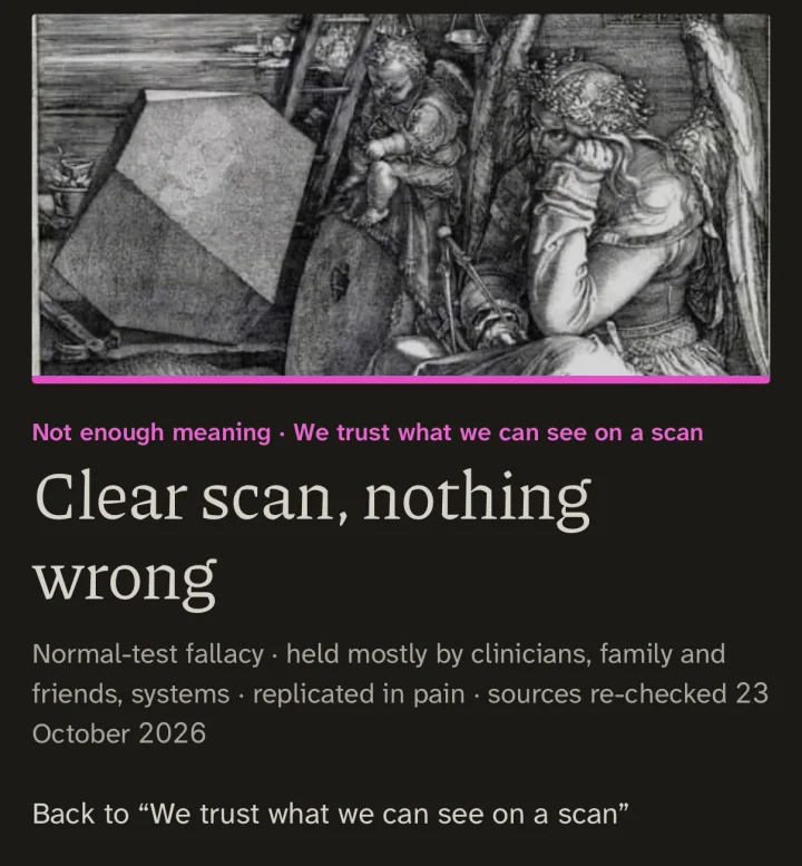
Pain Bias Codex · 165 patterns
The day of the appointment
Read more about the Logic of Pain, Tropes and the Pain Bias Codex
Logic of Pain
What it is. Each argument is written as a formal statement, and its form is checked in Lean, a proof assistant. Lean checks the form of an argument. It cannot say whether a premise is true of anyone. In 41 of the 56 the conclusion does not follow.
What it does for you. Take “Your scan is normal, so nothing is wrong.” The page shows the step nobody said: “Every pain condition shows up on a scan.” Said out loud, it does not survive. Plenty of real causes of pain leave nothing for a picture to find. Each of the 41 comes with its missing step, and with what the argument gets right.
Why it is there. I spent years on the wrong end of arguments like these, too worn down to find the hole. Now the form of each argument is checked by machine, in 171 theorems, and its missing step is written in plain words.
Tropes
What it is. Each entry sets out what the evidence supports in a saying, and what does not follow from it. The saying itself stays covered until you choose to see it.
What it does for you. “You look fine.” The entry is called “A face read as a measurement”, and it says: “A smile can belong to the moment while pain belongs to the same afternoon.” You will have heard most of these. Here each one has already been thought through, so you do not have to do it on the spot.
Why it is there. Family, friends and colleagues say the same few sentences, mostly meaning well. I wanted an honest answer to each one that does not make an enemy of the person who said it.
Pain Bias Codex
What it is. A map of patterns of judgement around pain, each with a plain name and an example. It opens: “Every mind does this. These are patterns of human judgement around pain: in people who live with it, in families, in clinicians, in researchers, in systems, and in the people who made this codex. Naming one is not a verdict on anyone.”
What it does for you. One entry is “The day of the appointment”: one appointment’s pain score treated as if it were every day. Its example: “That Tuesday was the best day in six weeks, and it now outranks the other forty-one.” When it happens to you, you have a name for it, and you can point to it without accusing anyone.
Why it is there. Much of the harm I met came from ordinary thinking under pressure, left unchecked.
Calm
Some hours are not for measuring.
Slow breaths, a body scan or a recorded voice, with a quiet scene to look at and nothing to fill in. Calm is not a treatment.
Read more about Calm
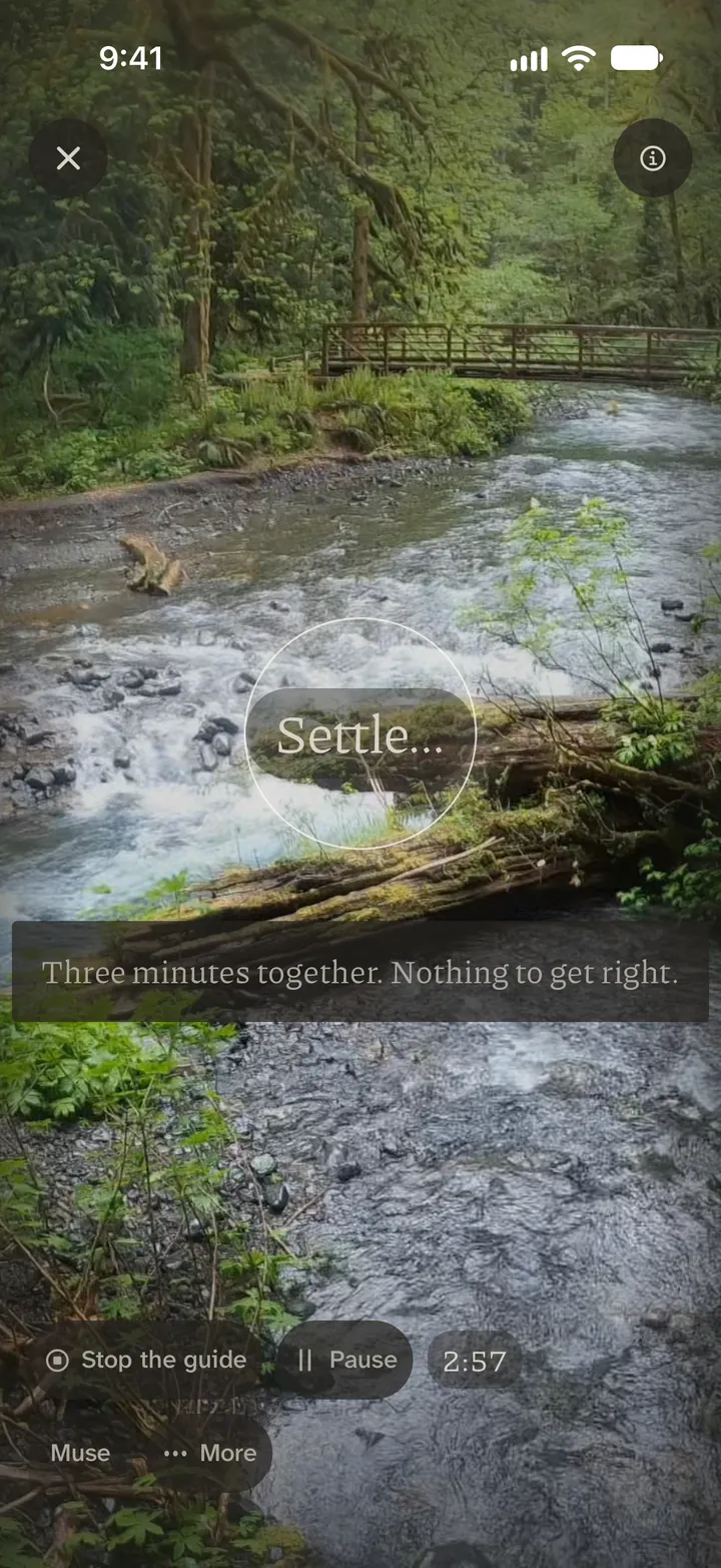
What it is. A few slow breaths, a body scan, or a recorded voice, with a quiet scene to look at. In for four, out for six.
What it does for you. Something for the worst hour, with nothing to fill in.
Why it is there. Some hours are not for recording. Calm is not a treatment.
 12
The ring paces the breath.
Three minutes. Stop whenever you like.
Three of Calm’s scenes
Each scene plays its own field recording; tap to hear twenty seconds. The ring over the first breathes in for four, out for six.
The Commons Being built
Pain isolates.
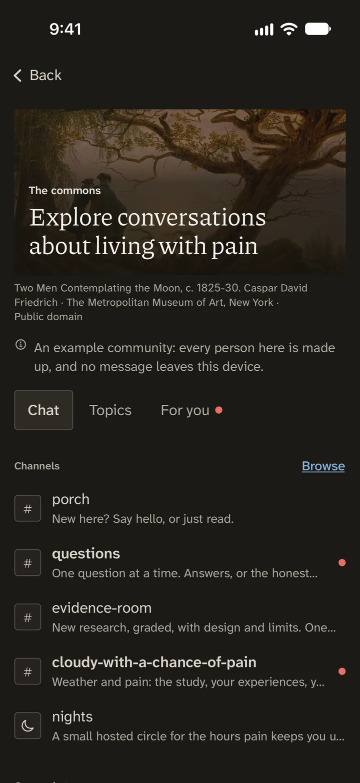
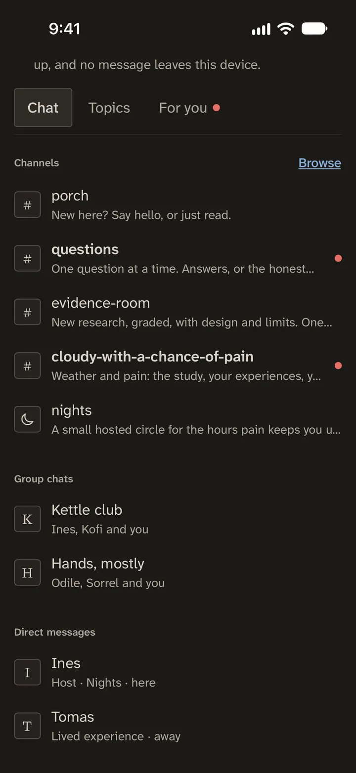
A place to talk with people who also live with pain. Today it is an example community in which every person is made up.
Read more about the Commons
What it is today. An example community in which every person is made up. Nothing in it leaves your phone.
What it will be. A place to talk with people who also live with pain. It is built to stay quiet: notifications wait during quiet hours, previews never show a message’s text, you can mute anyone, and on a hard day its line stays off your Home screen. The plan is for each member to write under a pseudonym, with no real email or health data passed in the sign-in. There is no opening date yet.
Why it is being built. Pain isolates. The people who understand soonest are usually the ones living it.
 123
Every person here is made up, and the page says so.
Channels you can simply read.
A channel for the hours pain keeps you up.
Visit Prep and the visit report
Your words first.
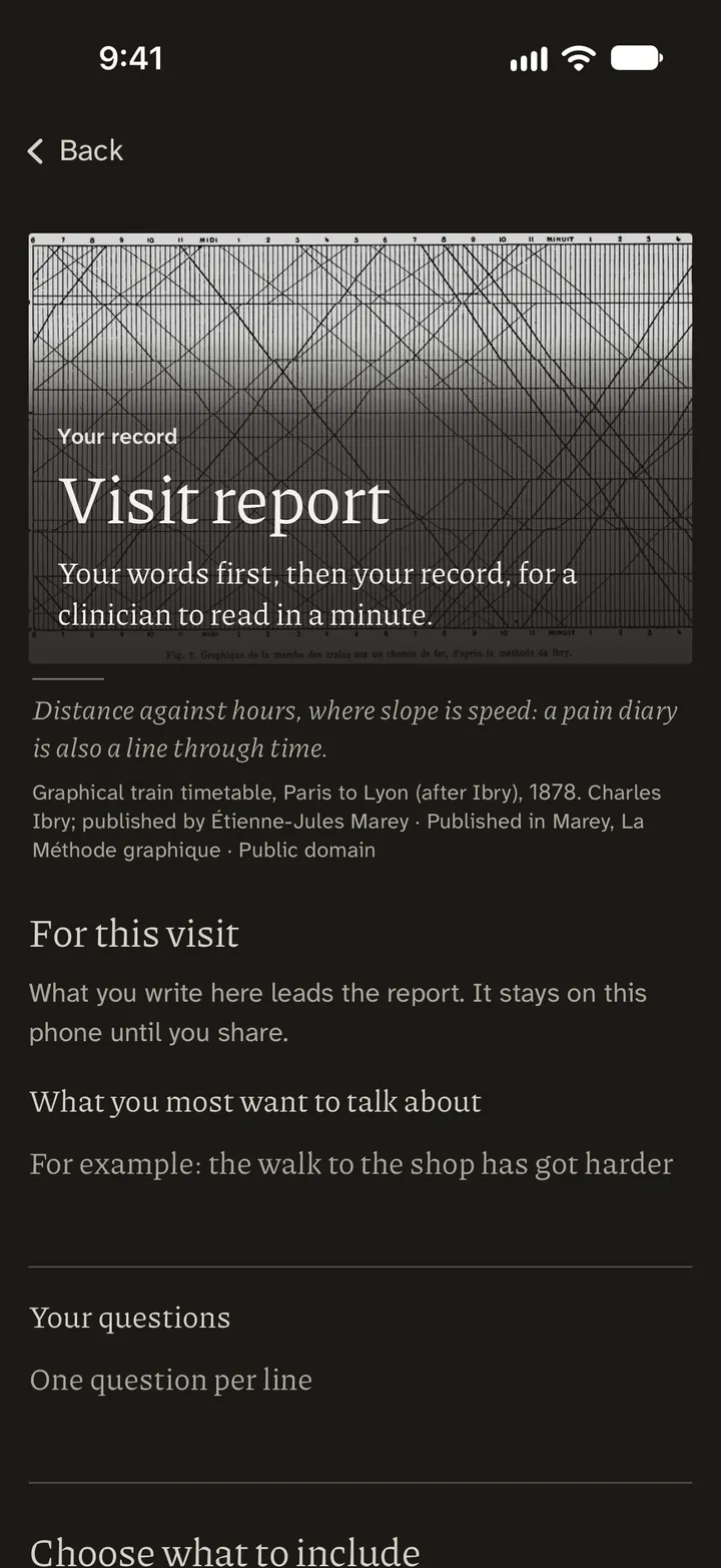
One report for everyone who treats you, opening with your own words.
Read more about Visit Prep and the visit report
What it is. Visit Prep is where you choose your questions and what to bring to an appointment. The visit report is a PDF made on your phone, written to be read by a clinician in a minute.
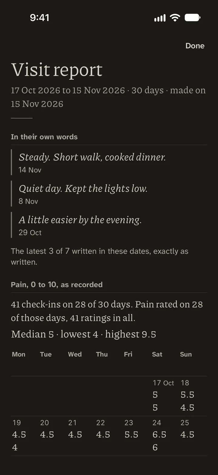
What it does for you. The report starts with the words you put in it, under three plain headings: “To talk about”, “Questions” and “In their own words”. Then the days you rated and your median, lowest and highest ratings, over 14, 30 or 90 days, with the gaps left in. It goes only where you send it. Hand the same page to everyone on your care team, and there is less to tell again from memory.
Why it is there. I was tired of being the only link between the people treating me, on the days I was least able to be.
 123
It opens with what you wrote.
Then the plain numbers: median, lowest, highest.
Each day’s ratings, set out by weekday.
Dial, for Mac In testing
On your desk, too.
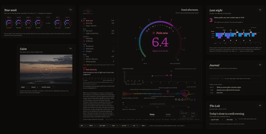
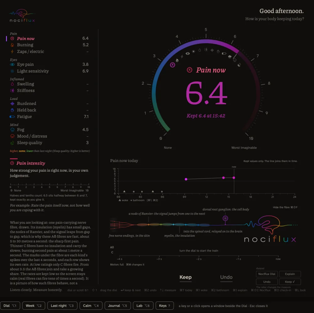
Turn the dial, or type a number, to keep any of thirteen measures. The Mac app is in testing; there is no download yet.
 1234
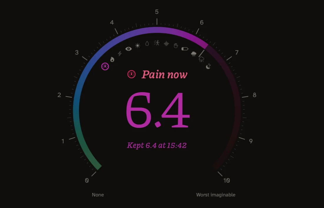
It greets you by the hour.
Turn the dial, or type a number. Return keeps it.
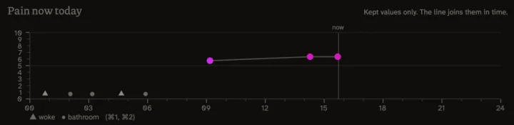
Today, on a scale labelled at every whole point.
Keys open its small windows.
Its small windows In testing
Where it runs
Where it stands today.
Phones first. The watches and the desk are being tested or built, and each says where it stands.
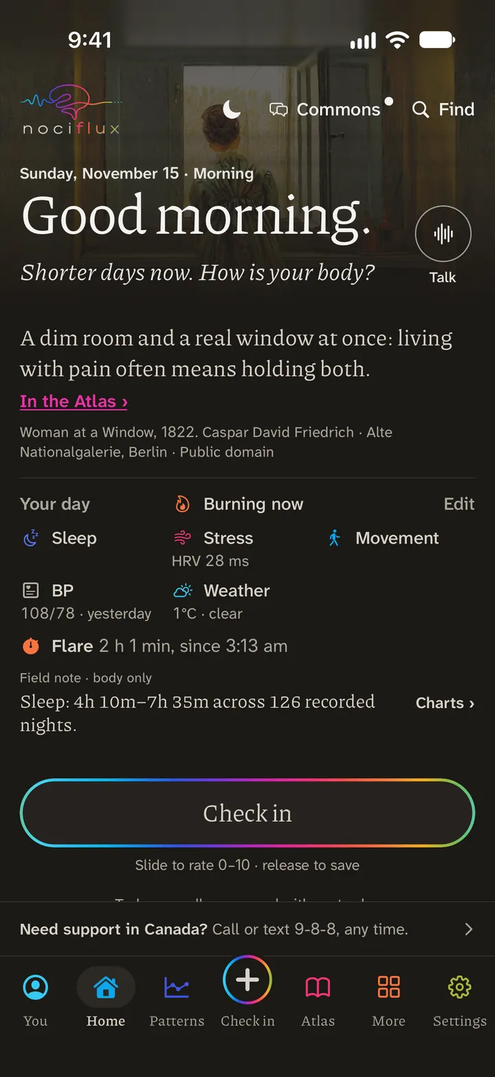
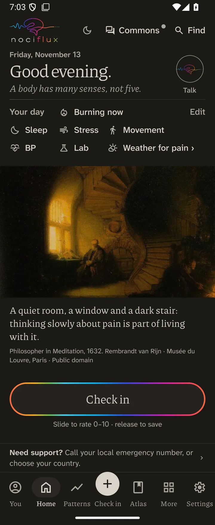
- iPhoneIn early testing
- AndroidIn early testing
- Web appIn early testing
- Apple WatchIn testing
- MacIn testing
- WindowsBeing built
- Galaxy WatchComing soon
- LinuxComing later
A Galaxy Watch already shares its readings with the Android app through Health Connect.
Being built Pro, for professionals
For the people who treat and study pain. You decide what is shared. Ending access cannot take back copies already received.
Read more about Nociflux Pro
The side of for the people who treat and study pain. We are building views of the record a person chooses to share, arranged for a clinician’s own specialty, and separate tools for research. Today’s preview runs on invented people. One rule will not change: the person in pain decides what is shared and can stop, and research needs a separate choice of its own. Stopping cannot take back a copy someone has already seen.
App Store coming soonGoogle Play coming soon
Also inside
And the rest of the day.
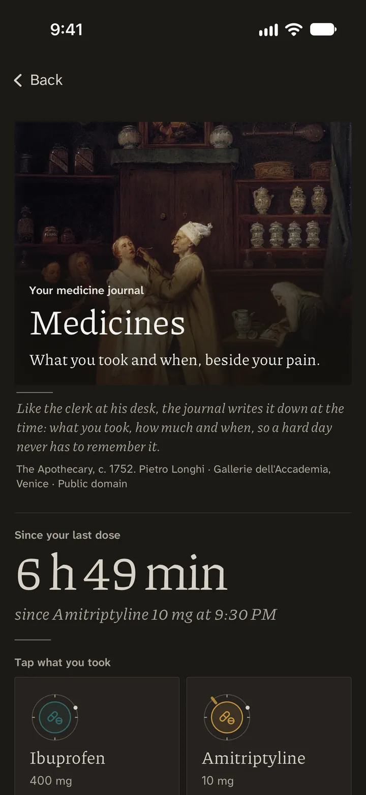
What you wear, your medicines and registered trials, in the same app.
Why I made it
I live with severe pain. Every day, for years. It decides what I can do.
Everything but truth becomes loathed in a sick-room.
I have been pushed to my limit and past it, more than once, and from several directions at the same time: the pain, the appointments, the forms, the money, the people who could not see it. At times it felt as if the whole system had lost the ability to see what was in front of it.
Then the pain broke me. In those same years I watched many people with my diagnosis lost to deaths of despair, and in 2020 the first lockdowns shut what was left of ordinary life. That is when I began. I worked as a quant in finance, so probability was the tool I had. I wrote the missing steps down, and I set every description of pain I could find side by side, each with its sources and its limits. It has become thousands of pages. Most of them are negative results and dead ends, turn after turn in a winding garden of forking paths. That work is the Mathematical Institute for Research of Pain. It is dedicated to the people I lost, and the dedication is on its Outlook page.
If the pain brings thoughts of suicide, that is not a failing. Need support now? Crisis lines by country.
Read the rest of the letter
Here is the trap. The worse the pain, the less you have left to work with. On the worst days I cannot finish a paper or hold an argument in my head, and those are the days the form is due, the appointment is short, and my whole history has to be told again from the start. Work gets harder to keep, so the money goes too. That is when the most is asked of you.
For years I was asked to describe my pain: a number from zero to ten, a face on a chart, words from a list, crosses on a drawing of a body. The textbooks had their names for it. The trials reported what happened to a group on average, which is not the same as what happens to one person. Nobody could show me how any of it fitted together, or where my own days belonged.
And much of what I was told did not hold up. “Your scan is normal, so nothing is wrong.” “You managed the wedding, so you could work full-time.” Each rested on a step nobody said out loud. An argument with a missing step has a name, an enthymeme, and once the step is written down you can see what you are being asked to believe. I do not think this comes from bad intentions. It comes from hurry and habit in a strained system, and I have met careful and generous clinicians inside it. But patients pay for it, in money and in months they do not have.
Then I built the record I had needed all along. A number at an appointment says almost nothing, because pain moves: across a day, through a night, in flares, in the days after a hard one. To see that, it has to be written down often, for months, by someone who may be too tired to write. So a check-in can be one number, and it can be 6.5 or 6.75 when that is truer than 6 or 7. A day you miss is a gap and nothing more. If you wear a smartwatch, your sleep, heart and movement can sit beside your ratings. On myself I am also trying a glucose sensor, because my burning seemed to follow sugar and I want to know whether my own record bears that out, and a Muse EEG headband, which I cannot offer anyone else until its maker agrees.
Around the record I built everything I had needed and could not find. First the N-of-1 Lab, because the question I most wanted answered was whether a change does anything for me, and a good week after starting something proves little. Then the Atlas, the Logic of Pain, Tropes and the Pain Bias Codex, so that what took me years to gather and check is there for someone who has neither the years nor the strength. Readings can be read aloud when a screen hurts, and a card you wrote on a calmer day can speak for you in a flare. The report you take to an appointment starts with your own words.
It is not a treatment and it has not taken my pain away. It has let me see my own patterns sooner, and walk into an appointment with my record in my own words. I built it because I needed it, with all the care I have. It is open by invitation now because I know I am not the only one.
Behind
The Institute.
is made by the Mathematical Institute for Research of Pain, at painmath.org. The Institute has an invitation of its own. This is the ground it covers so far.
- 155
- rooms on pain, in nine corridors
- 6
- books; one holds 63 records of pain kept over three thousand years
- 171
- pictures, songs, films, stories, poems and sayings in the Library of Pain
- 84
- tissue and condition dossiers, every one still a draft
- 384
- entries in the Table of Pain Targets
- 56
- small instruments and games for exploring pain, and 30 working models
Read more about the Institute
Nine corridors, 155 rooms. Most of the corridors are named for a question a person in pain asks. Why does it hurt? Is it real, and will I be believed? Did it help? What caused it? Can a machine know pain? How do we know? One room is “Who Gets Believed”. Another asks “Do flares call flares?” The last corridor, Holes in the Evidence, takes well-known claims and asks what they rest on. One of its rooms: “Does chronic back pain shrink the brain?”
Six Books.
The Book of Witnesses: 63 records of pain kept over three thousand years, on stone and clay, in diaries, letters, case notes and testimony. The oldest is an Egyptian stela of the thirteenth century BCE: “And he caused me to behold darkness by day.”
The Book of Numbers: 95 numbers quoted in pain science, each with its source, its history and its limits.
The Book of Experiments: 85 experiments, the ones that taught us something true about pain and the famous ones that did not.
The Book of Shapes: 74 shapes pain takes in time, from a fraction of a second to years.
The Book of Bridges: 49 bridges from a single ion channel to a whole population, each with what has been derived, what has only been measured, and where the step fails. One of them says: “Neither a group average nor a brain scan decides whether one person’s pain is real.”
The Book of Nerves: 69 measurements of where the body is wired for feeling, and what the counts do not say about pain. “A count records how many fibres are left. It does not record how they are behaving.”
The Library of Pain. 171 pictures, songs, films, stories, poems and sayings about pain, from the Book of Job to the present day. The first is a pen drawing the size of a hand: Albrecht Dürer, stripped to the waist, points at a spot on his side, and the line of writing above says there it hurts. In the app, Pain across cultures gathers 157 sayings and teachings on pain from ten regions of the world, with their sources.
The Atlas of the body. 84 tissue and condition dossiers so far, from the cornea to the dorsal horn, every one still marked as a draft. The aim over the coming years is to map every major tissue and nerve to the pain conditions that involve it, with the data that truly exists for each and the gaps left showing. Eighty-four is a start. It is nowhere near the whole body yet. The Atlas Sky draws 2,230 entries (readings, nerves, conditions, trials, definitions) as stars, placed by the 2,664 links between them.
The Table of Pain Targets. A ledger of molecules: 384 entries on pain-related molecules, molecular families and pathways, arranged by function and by where in the body they act, with human genetic evidence and 767 records of human testing or use. You can search it by molecule, gene, drug or condition, follow one of 32 recorded pathways, and see which steps were studied in people, in animals or in cells, and what remains untested. I wanted a clearer way to search the routes by which pain may be produced, and to see how many there are. There are a great many, and much of the newest work is still conjecture.
The Lab. 56 small exact instruments and games, each built for one question about pain, and 30 working models inside the rooms. In “Name the Engine”, five hidden engines write pain diaries and you work out which one wrote the diary in front of you. “Your Own Ruler” begins: “When you give your pain a number, the scale works like a ruler. But is the ruler straight?”
The Institute’s own Pain Bias Codex. 127 checks on how people judge pain, a different edition from the app’s 165. It begins: “Pain does not have to look a certain way to deserve attention.” The Compass is where you practise them on real claims.
The Outlook. The Institute’s long view of where pain research may lead, with no date and no promise.
The Charter. The Institute’s promises to people in pain. The first: “We will respect your account of pain.”
It is not finished. What is there is sourced, and it opens by the Institute’s own invitation.
Join the waitlist
is in alpha, heading into beta testing, by invitation only. Leave your email and we will write when a place opens. A person reads every request, and invitations go out by hand, so we cannot promise a date.