Need support now? Crisis lines by country
Press
Press and brand kit
For journalists, editors, podcasters and anyone writing about Nociflux: what it is in a sentence and in a paragraph, the facts, the logo, and screens you may use.
Press questions: admin@nociflux.com. A person reads every message.
In one sentence
Nociflux is an ecosystem for living with pain, made by someone who lives with severe pain, for anyone who lives with pain. It runs on iPhone, Android and the web, and is in alpha, heading into beta testing, by invitation only.
In one paragraph
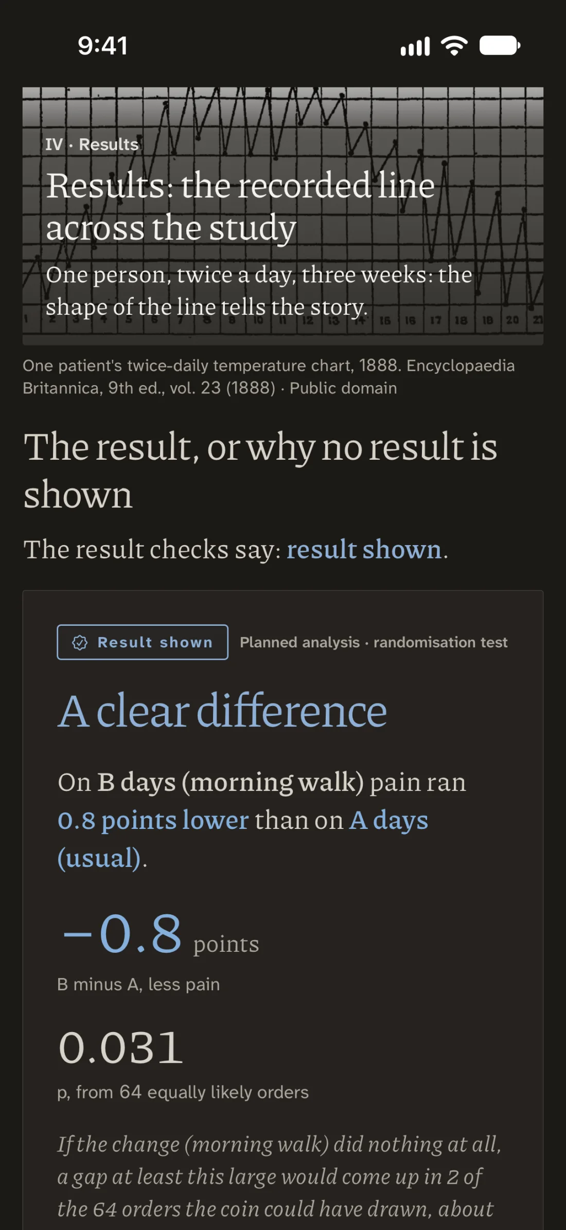
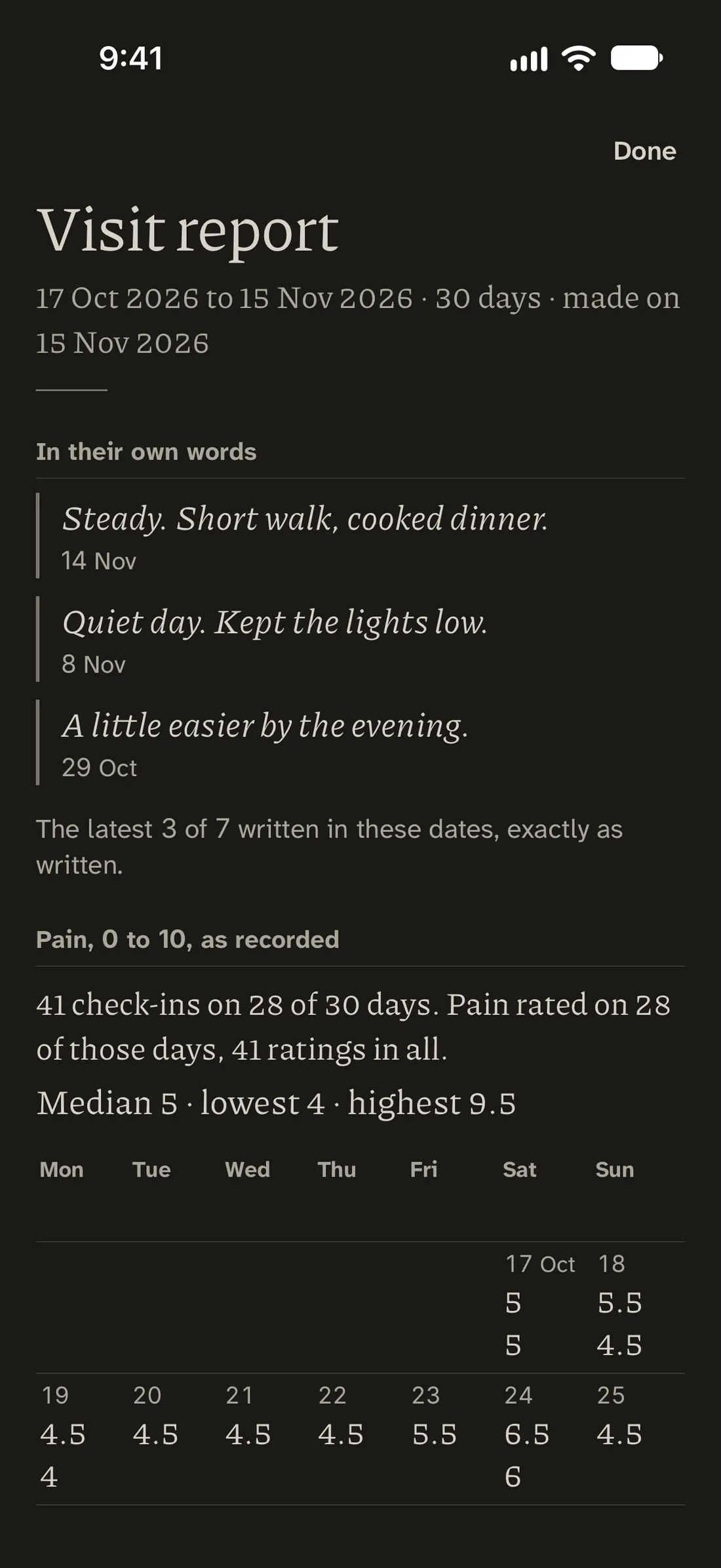
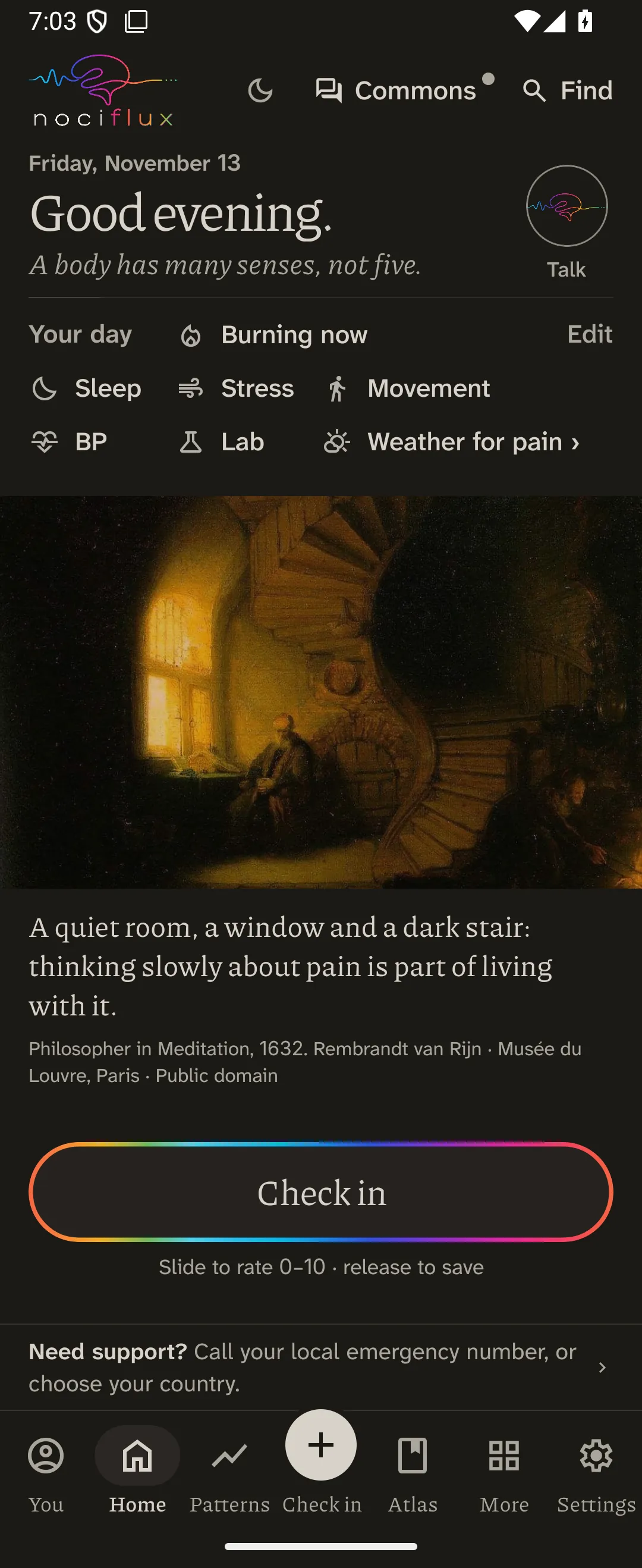
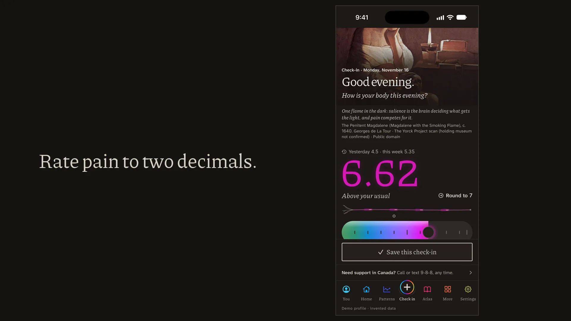
Nociflux is an ecosystem for living with pain. At its centre is one honest record: a check-in from 0 to 10, to two decimal places, with the person’s own words beside it. A day they miss stays a gap; it is never filled in for them. Around that record sit the parts a life with pain asks for: a Flare clock that keeps how long flares last, Speak for me for the hours when talking is too much, Calm, the Atlas, a visit report that opens with the person’s own words, and the N-of-1 Lab, a fair test of one everyday change on one person, in which a coin chooses the order of the weeks and the plan is sealed before the first rating counts.
Nociflux does not diagnose or recommend treatment, and it does not forecast anyone’s pain. It was made by someone who lives with severe pain, for anyone who lives with pain, and it is made by the Mathematical Institute for Research of Pain (painmath.org). It runs on iPhone, Android and the web, and is in alpha, heading into beta testing, by invitation only.
The facts
As of 17 November 2026.
- What it is
- An ecosystem for living with pain.
- Who it is for
- Anyone who lives with pain: people whose pain followed an illness, an injury or an operation, veterans whose pain followed their service, and people whose pain nobody has yet explained.
- Made by
- The Mathematical Institute for Research of Pain (painmath.org), made by someone who lives with severe pain.
- Status
- In alpha, heading into beta testing, by invitation only. Anyone can join the waitlist at nociflux.com/join; a person reads every request, and invitations go out by hand.
- Where it runs
- In early testing on iPhone, Android and the web. In testing on Apple Watch and Mac. Being built: Windows, and Nociflux Pro, for the people who treat and study pain. Coming soon: the Galaxy Watch app, and the App Store and Google Play.
- What it does not do
- It does not diagnose or recommend treatment, and it does not forecast anyone’s pain. The N-of-1 Lab never tests a change to a pain medicine.
- The pictures
- Every record shown in the app’s screens is an invented example, never a real person’s.
The logo
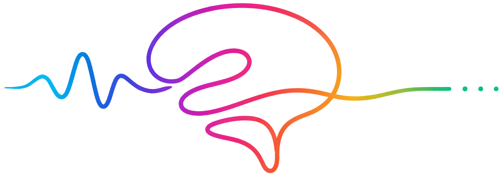
The logo is one line that starts as a wave and becomes the outline of a brain, over the name in spaced lowercase letters. Please use it as it is: no redrawing, recolouring, stretching, outlines or shadows. Use the version for dark backgrounds on dark ones. In running text the name is written Nociflux.
The line alone, without the name: SVG.
Colours
The logo’s line changes colour along its length. These are its four pairs, one for each letter of “flux”, and the two papers the app is set on.
- f #F74F35 to #F87E27
- l #F3B418 to #EDA420
- u #1AC982 to #077FD3
- x #713FDE to #D216A4
- Light paper: ground #ECEAE7, ink #1C1914
- Night paper: ground #1C1915, ink #D7D2C8
Type
Two typefaces, both free under the SIL Open Font License. Piazzolla for greetings, titles and quotations, and Atkinson Hyperlegible Next, made by the Braille Institute for readers with low vision, for everything else.
Screens
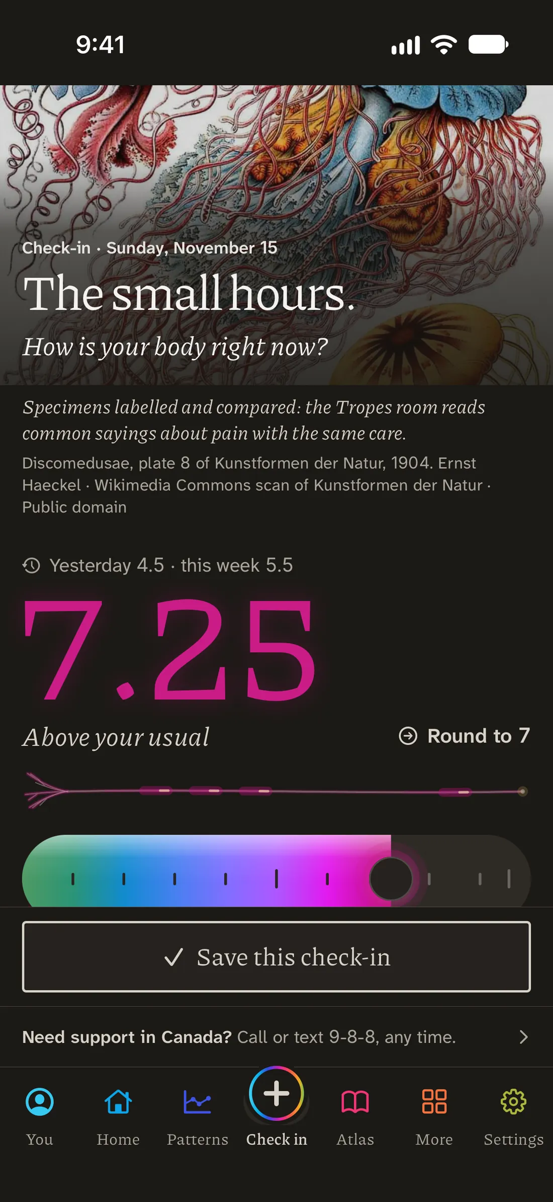
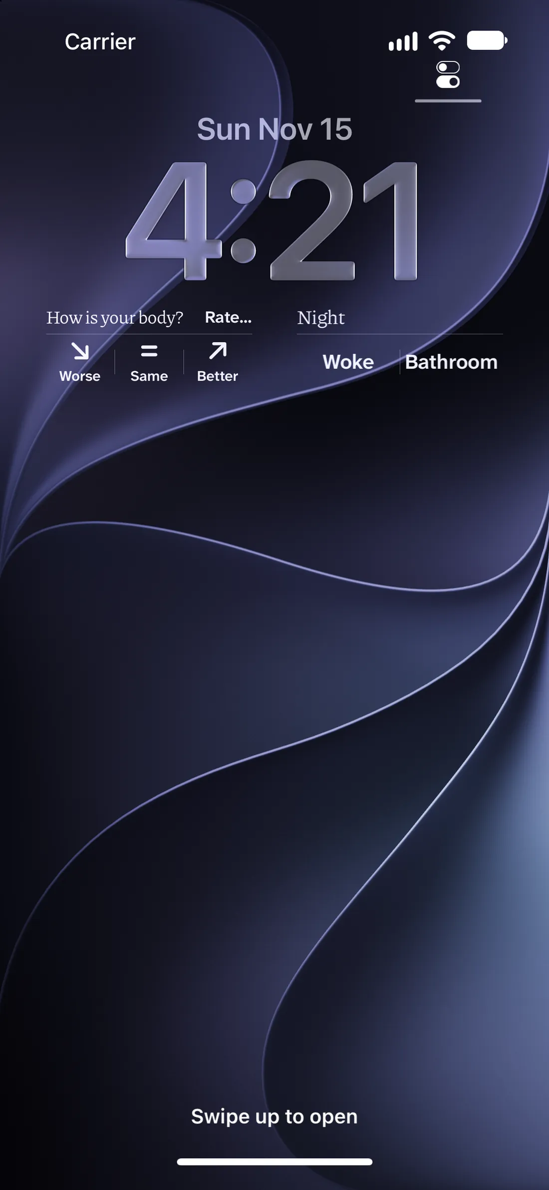
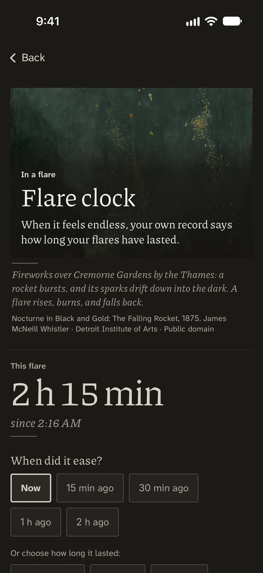
Real screens of the app, each from an invented example record. Each picture links to a larger file.
Film
The Institute
Nociflux is made by the Mathematical Institute for Research of Pain, which works through the questions people in pain actually ask, in layers from plain words to the mathematics. Its own press page: painmath.org/press.
What Nociflux does, part by part · The invite page · What’s new in Nociflux · The Institute’s pain math overview